Analytics and customer insights showed where people were dropping off between the public IKEA Family pages and the members’ hub, what they were looking for and what was stopping them from joining. We turned those insights into clear design actions.
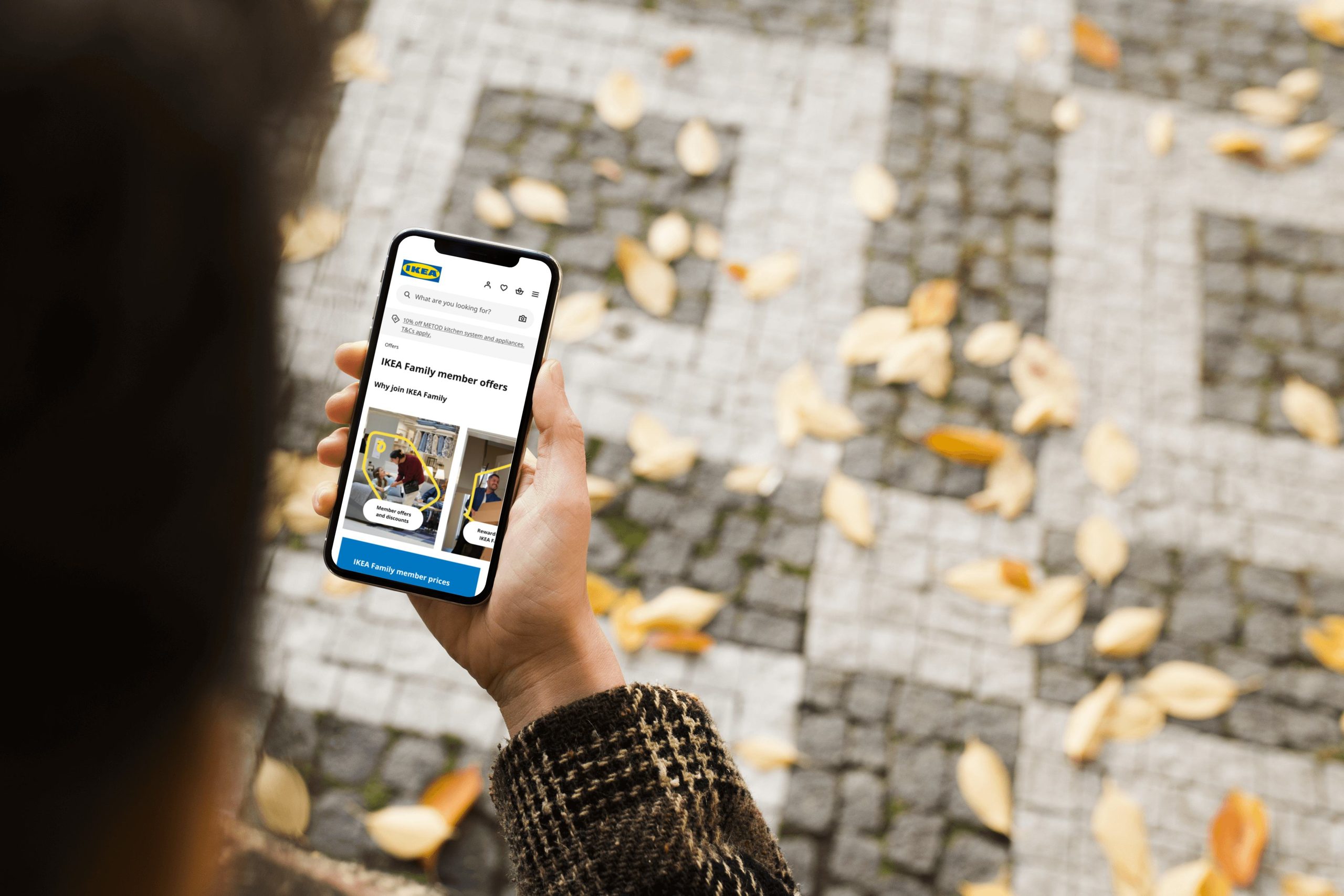
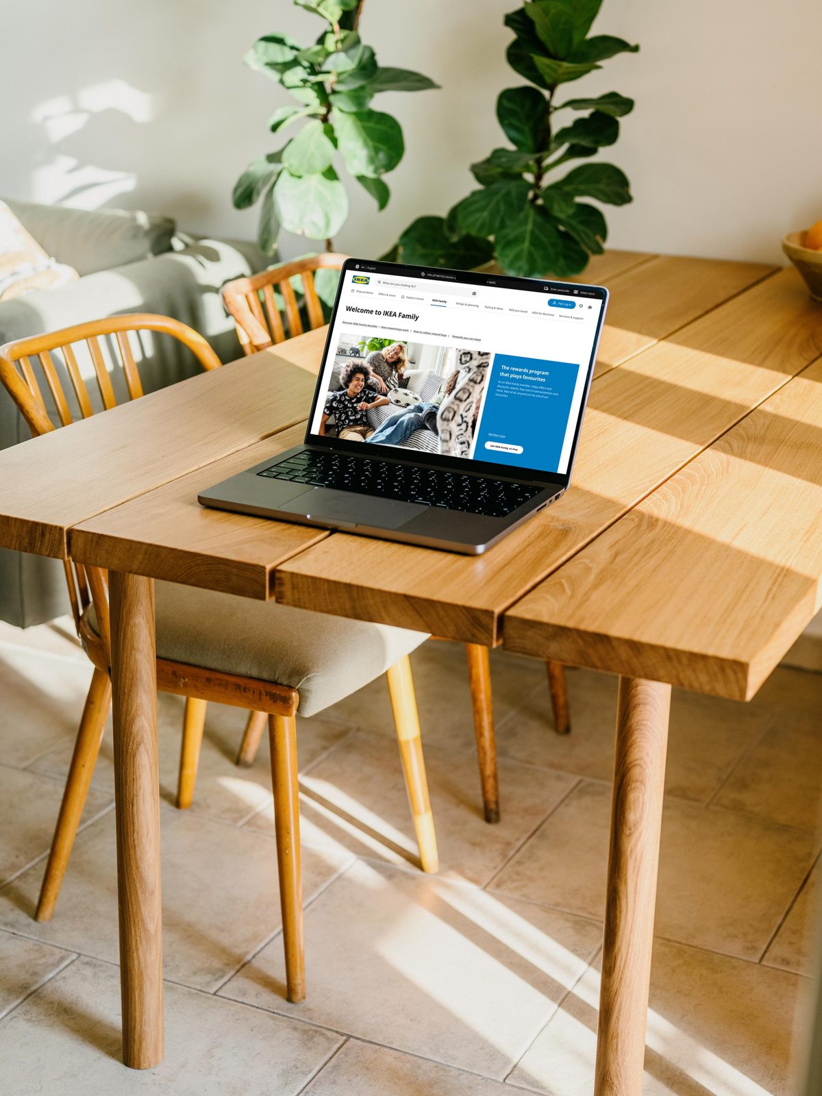
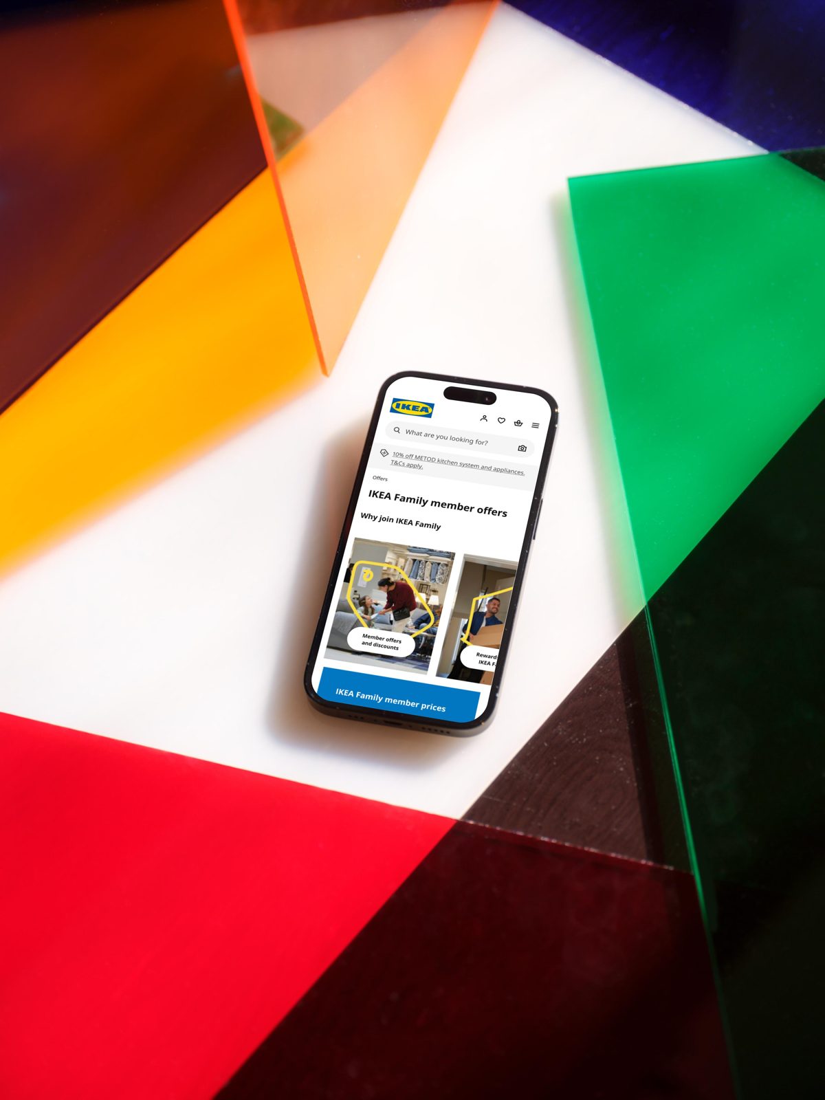
From there we designed the IKEA Family journey mobile-first, around three things customers needed to do: find the right information, understand the value, and sign up or log in.
That meant a UX redesign focused on conversion: clearer benefits and simpler, more human language on the landing pages, more visible paths to join or log in, IKEA Family in a more prominent place in the website menu, and product pages that make it easier to choose and add to cart.